19 kitchens from my super-secret Insta saves
19 kitchens from my super-secret Insta saves
For that remodel we keep buying lotto tickets for.

(Kitchen by Another Human)
Out of all the rooms in a home, the kitchen is one that’s the most likely to top a reno list. Why? Because the kitchen is personal; it must function for a specific individual and family. Sure, bathrooms are also high on the reno list, but everyone poops in the same fashion (as far as I know). But eating/cooking habits are another thing, and when you inherit a house with a kitchen that doesn’t feel right (or is outdated), all you can think is, “How could these people live like this???” I don’t mean to make it sound like a kitchen reno is easy, because for most people, it’s the goal, not something you can just do.
As for us, we inherited a “newly renovated” kitchen, which it is. It’s a galley kitchen which isn’t my favorite but also works in the space. There’s nothing really wrong with it except that I hate it. It is gray and gray is the color of people thinking they are making classy decisions when in fact it is the opposite. It is a marker of zero taste, of a Home Depot multiple choice selection.
Kitchen “saved” folder on IG is a little like playing Barbie where every idea is an alternate reality. Am I “Italian palazzo Barbie today?” or do I feel more “Pasadena midcentury Barbie with vistas of dusty hills?” Maybe it’s a “Hudson Valley farmhouse kitchen Barbie” day. Or an “Altadena cool mom in a Doen dress kitchen Barbie” day. It always changes.

So let’s take a look. (Apologies for image quality; I tried to do these all as Insta embeds but I think I broke Substack in the process.) Here we go…
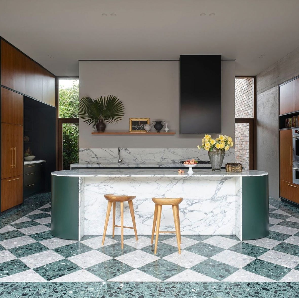
I’m a huge Leah Ring fan (also known as the brains behind Another Human). This image from a recent project in Pasadena combines a lot of what I’m looking for in a kitchen: color, unexpected cabinetry, and a mixing of styles that feels different.

Steel windows are starting to feel a bit overplayed but honestly, I’d take them. I love how scale is used in this space, care of Studio Etthem.
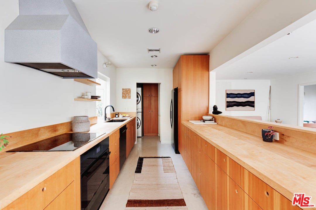
Here’s a definite Barbie moment — it’s from a real estate listing in Altadena from last year. The entire property is extremely stylized in this rustic-modern motif. Who would I be in this kitchen? Natural deodorant lady. Rich lady. Pretending not to be rich lady. Deodorant actually costs 38 dollars lady.
Here’s another real estate listing that isn’t remarkable but somehow stuck with me for nailing the warm minimalism look.
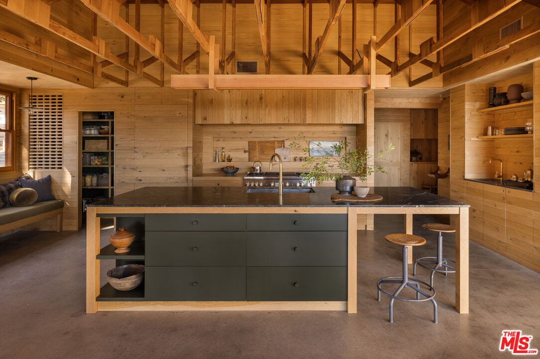
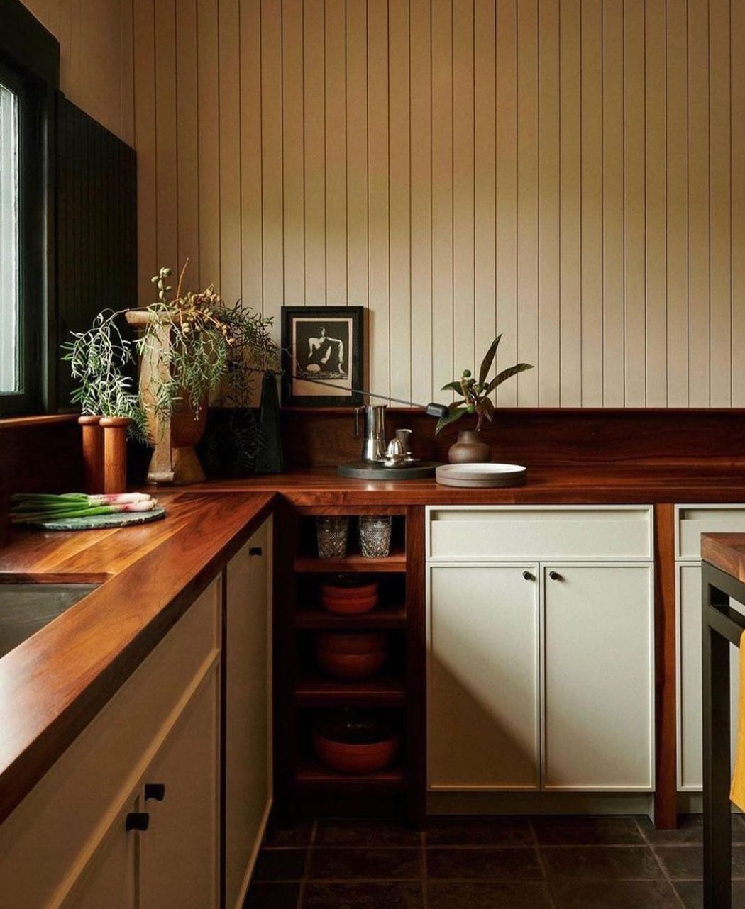
This kitchen by Pat Bernatz hits pretty close to perfect. I love how the wood of the countertops works to frame the cabinetry.
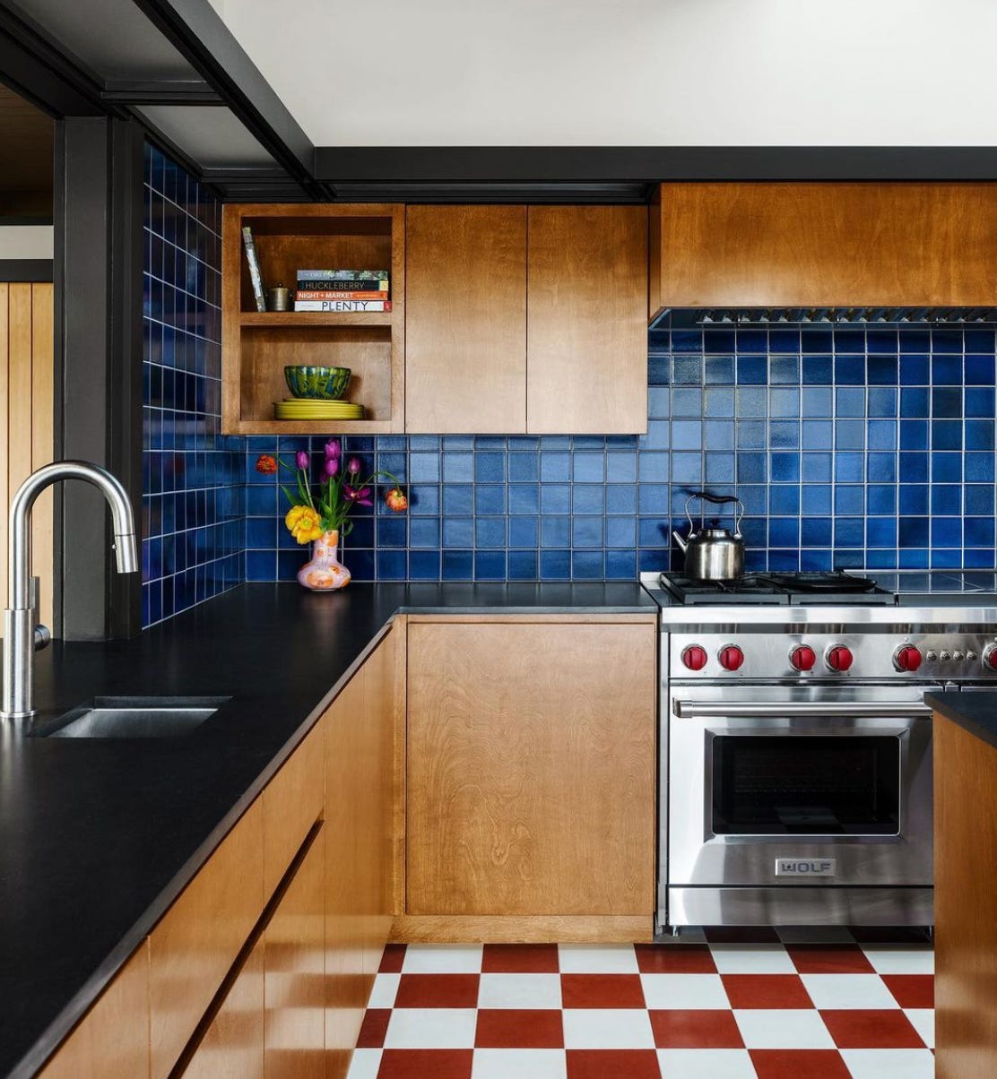
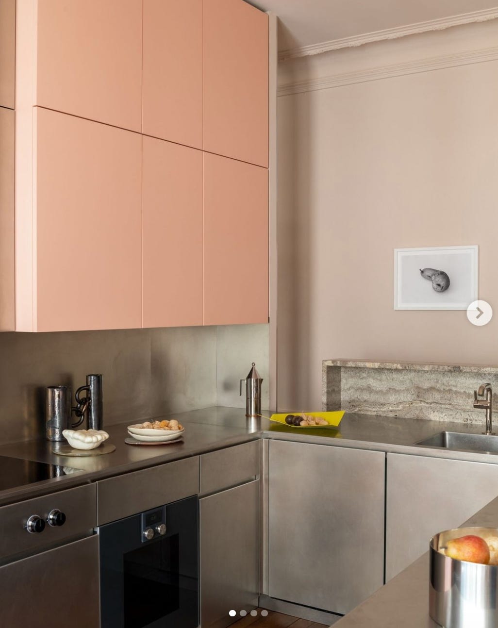
The aluminum kitchen is experiencing a renaissance; it’s not for me but I do appreciate how designers are throwing color in with it as seen in this cuisine by Paris-based Rodolphe Parente.
It’s really all about the British kitchen these days, although I’d say this one by London-based Studio Ashby has some Italian influence as well.

With a few mods, this kitchen by Flack Studio could work for me. I initially saved this because of the high-gloss barrel ceiling, but I’m also really loving the marble integration into the cabinets. That’s gonna be $$$$.

Definitely feeling like high-gloss/lacquer is about to have a moment in kitchen design. I think it probably works best in mid- to large-size kitchens. Maybe overwhelming in a tiny one? Credit here goes to Chused & Co.

I saved this space by Claire Brody several months ago — there are individual elements that I like a lot, but I probably wouldn’t go all in on this look.

Pam Sham for the win.

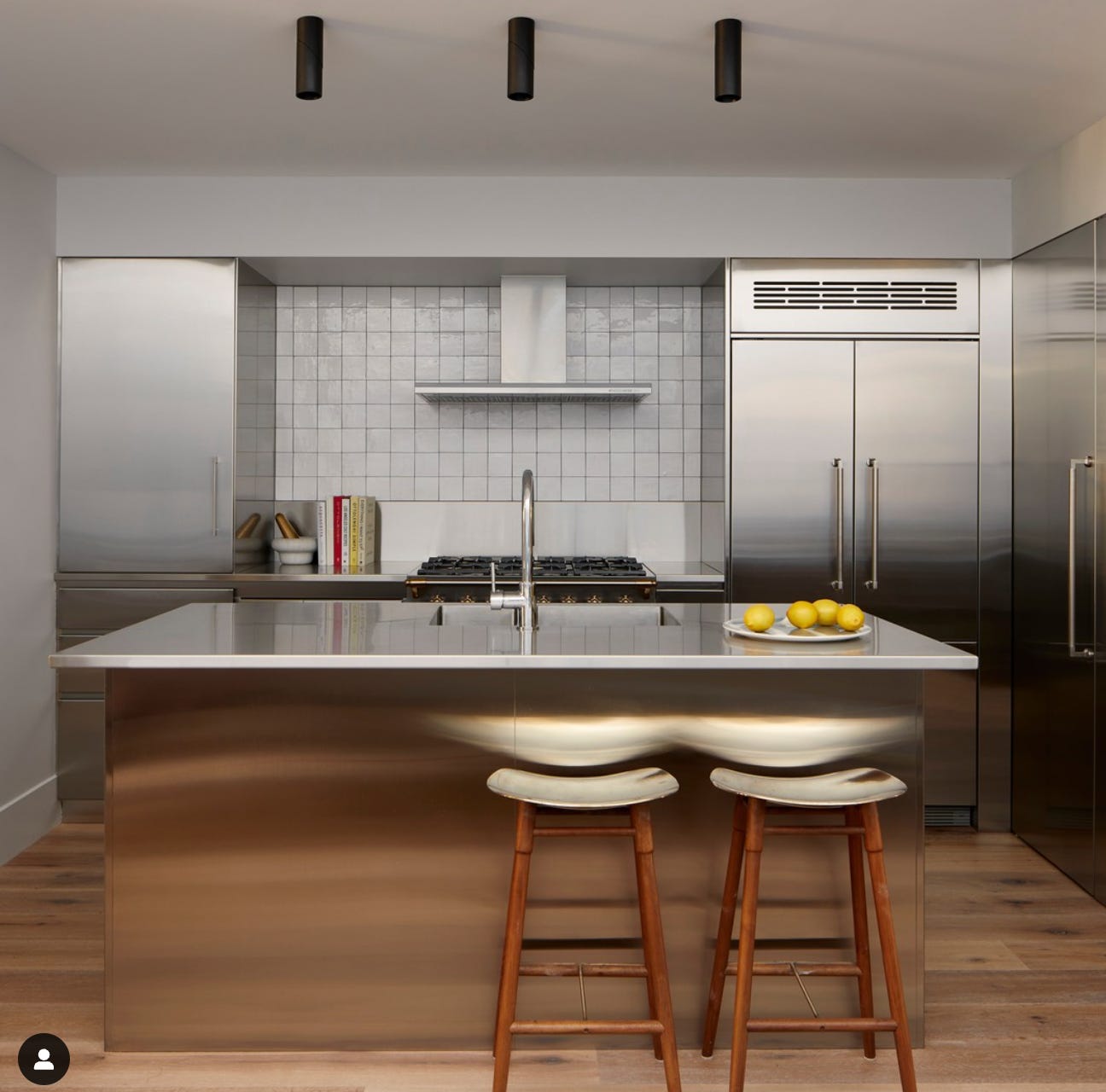
See what I’m saying about the aluminum kitchen? (More detailed report to come on Hunker in the near future.) It’s definitely a European vibe. This one here was created by Frankly Interior Design.
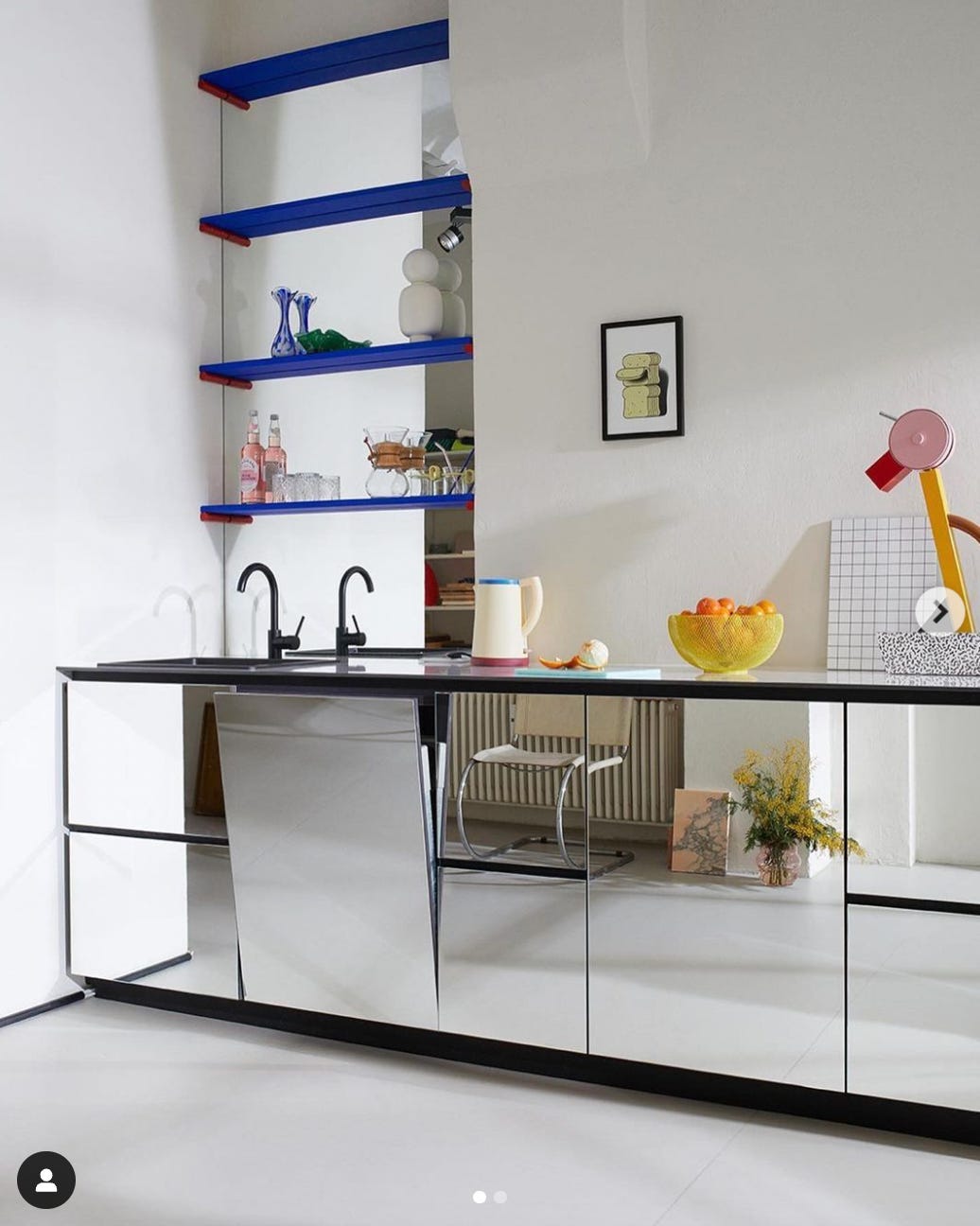
Taking this concept a step further, JÄLL & TOFTA went all in on mirrored cabinetry. I definitely appreciate the design risk — but this would be a nightmare with kids.
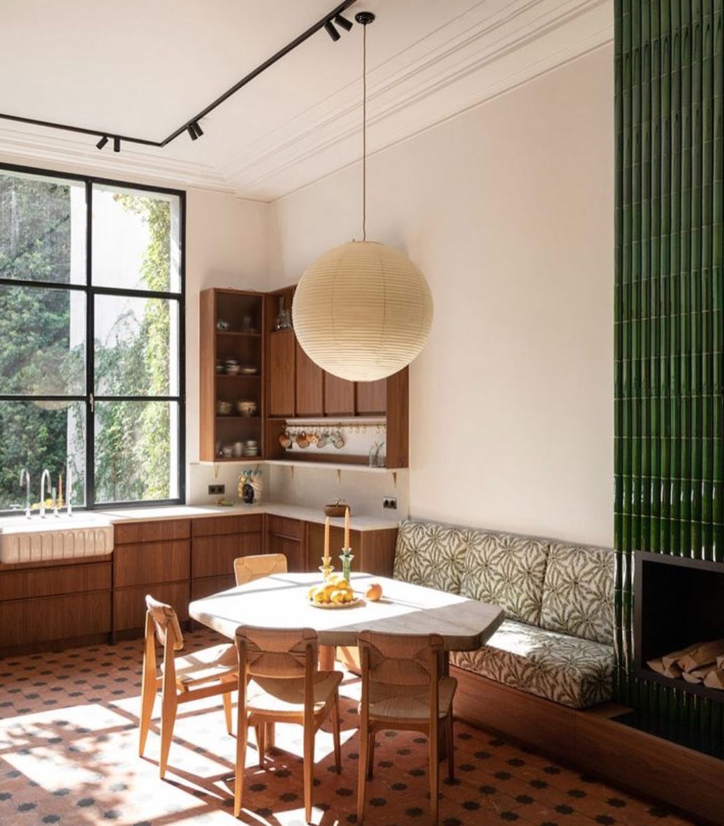
All you need to know is that this kitchen is located in Shropshire and was designed by a woman named Emma Ainscough.

So this is definitely more of the direction I’d like to go with my own kitchen overhaul (reno date TBD, prob never, RIP). Via @happyhauntedhouse on IG.

I’m thinking the above likely took inspo from Sara Charlesworth’s kitchen, which is basically Insta famous in its own right.
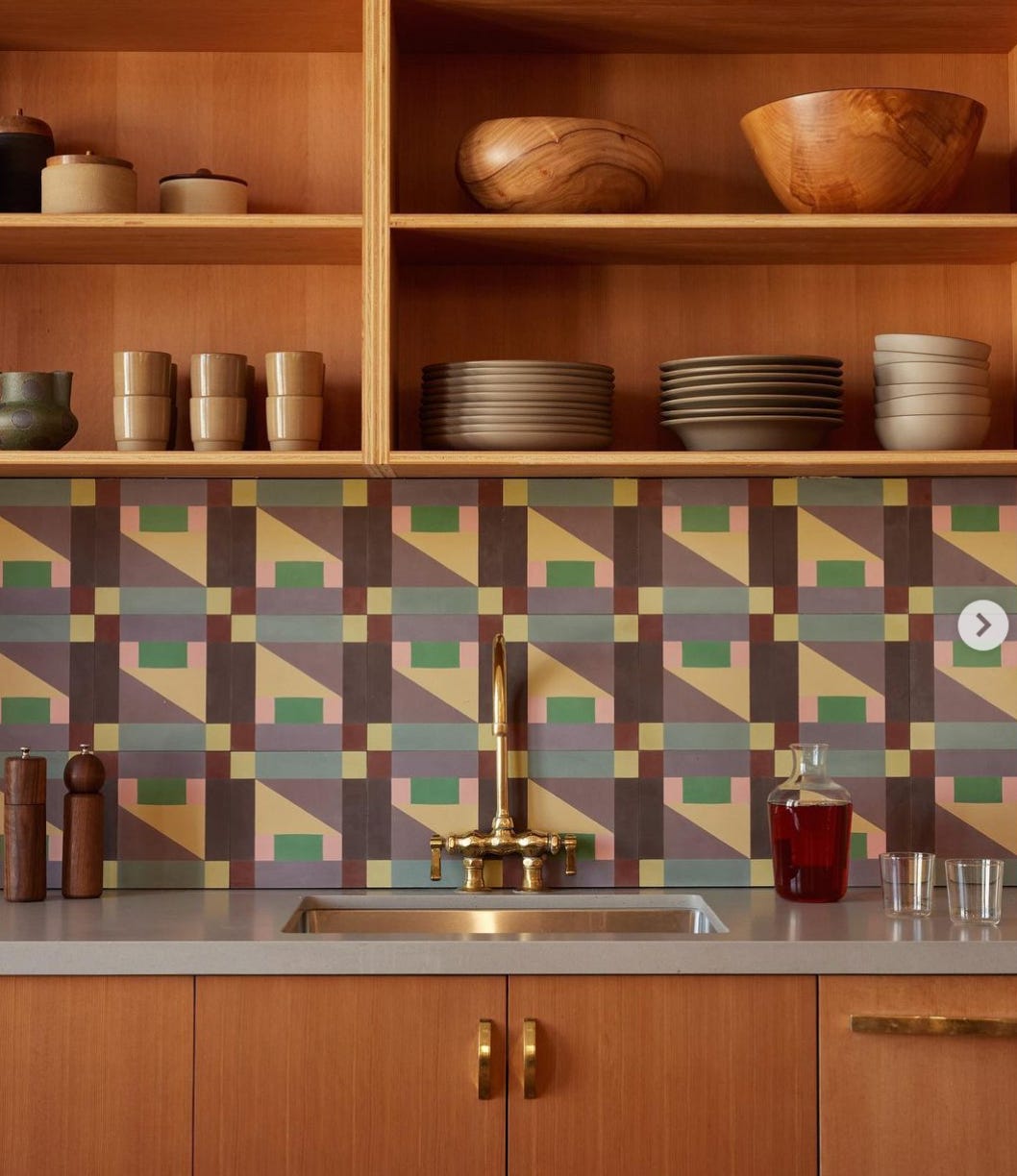
Commune has a relatively new tile collection called Abstrakt that you can get at Exquisite Surfaces. I think it’s AWESOME.
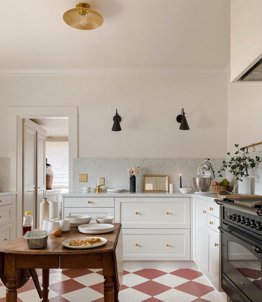
Here’s designer Meghan Eisenberg’s home kitchen. I love that this is a small space and feels super realistic and attainable.

And finally for my Italian countryside manse, this terrazzo-heavy beauty by Arent Pyke Studio.